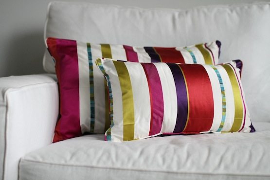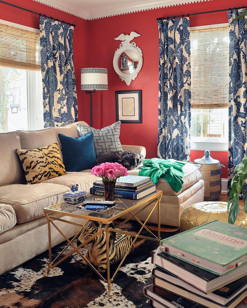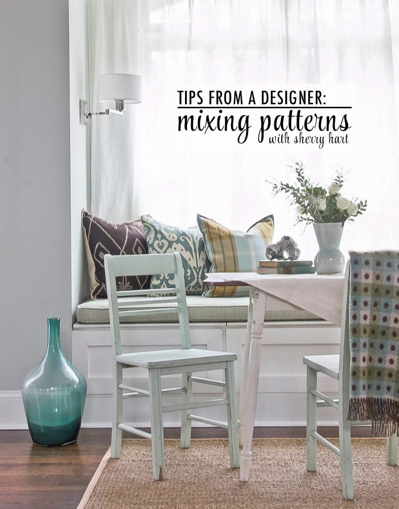
Mixing patterns in your home can be somewhat difficult. When flipping through my favorite glossy paged magazines and design books I often feel like interior designers have a magic wand as they make mixing patterns look effortless. I thought it would be great to have one of my favorite designers, Sherry Hart from Design Indulgence, over to The Chic Site to share some tips and help us all create a little pattern-mixing magic in our own homes.
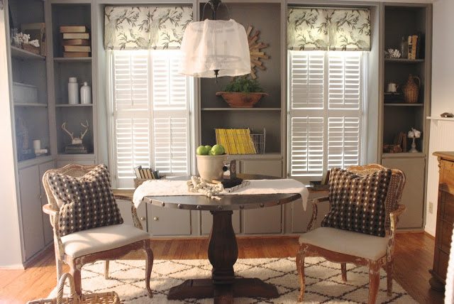
Sherry’s been in the design business for over 20 years. Her work has been published in Better Homes & Gardens and Southern Living magazine, among others. I refer to her as the “fabric whisperer” and you’ll soon discover why. Here she is…you may want to take notes! ~Carmel
—
In todays design world there are hardly any rules. When I first started in the business we always started with a floral, added a plaid, a solid and a small diamond pattern. It worked every time, but if I showed someone a plan like that today I might hear “crickets” 🙂
Now…. anything goes and sometimes it’s a win and other times it just doesn’t feel right, you know?
I am going to take a few fabric design plans and explain why I think they work.
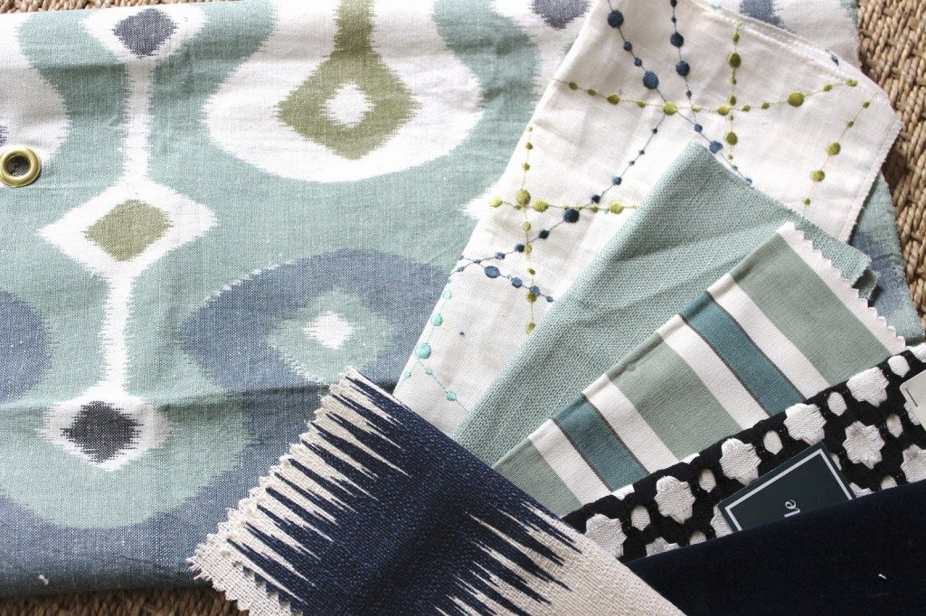
The first pattern is what I call my lead fabric. It is the one I will pull color from, and it’s also the focal point…… I don’t want to bring in another fabric with a pattern of similar size because it would compete.
I look for other selections to bring out similar colors and smaller patterns. The second fabric has a nice white background [like the lead] and like colors. I pared it with a pretty blue solid and a stripe. The black and white of course goes with everything. It’s hard to tell, but the other solid is a deep navy velvet, and then I added a modern fabric for fun.
I could see this plan with white walls….navy sofa and 2 chairs from the blue linen. The other would be pillow fabrics to bring in the punch.
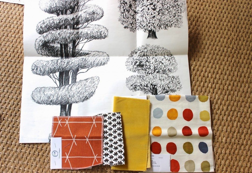
This was a plan for a boys room. I love the graphic of the black and white tree wallpaper. [Once again black and white is a neutral.]
The circle fabric is my lead, and I pulled from the colors in it to bring in a few splashes of fun, colorful fabric for pillows and window treatments. The smaller patterns on the left don’t compete with the circle fabric.
I would use a black bed, white bedding, the circle fabric as large shams with a solid yellow velvet lumbar in front.
This room had a window seat ,so I planned to use the orange fabric with pillows made out of the yellow velvet and small brown and white.
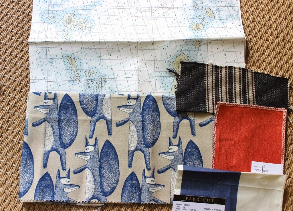
This is the same home. The map wallpaper is for the walls in a playroom. I fell in love with the fox fabric, so it will work as pillows on a brown leather sofa. Add in the black and camel stripe and the orange for pillows. Then the larger navy stripe for curtains. Again the fox fabric is my lead. Navy and orange go so well together, and of course black is a neutral like white.
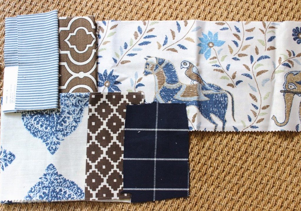
One last plan. I started with this John Robshaw fabric that has horses and elephants in blues and browns on a white background.
I pulled the 2 brown patterns, but would only use ONE of them in the design. Add in a lighter blue ticking stripe, and a darker navy and white windowpane. Then for a large pattern, I added the navy and white block print.
This was also for a boys room ,and I might paint the walls a deep navy. Using a wood tone bed with white bedding [easy to wash up!]. The large block print for window treatments.
There is a window seat in the room which I would use one of the brown fabrics on. The lead fabric with horses would be used for shams, and the navy windowpane as a lumbar. The blue ticking stripe on a chair.
It might seem like a lot of pattern but they all have white in them and the neutral navy walls along with the white bedding will allow the room to breath and not look cluttered.
Here are few things to remember when mixing patterns:
1. Use black and white in a room for freshness.
2. Only use one large pattern.
3. If the fabric has blue and brown in it think about going a shade deeper of those colors.
4. Edit your patterns to leave some room for art….the eye always needs a place to rest.
5. If using neutrals, texture and layering is very important.
—
Chic readers, I hope Sherry’s advice gives you more confidence to start playing and mixing patterns in your homes! To see more of Sherry’s amazing work, follow her blog – Design Indulgence.


