It’s The Chic Site Makeover guys, what do you think? When we set out to give this website a little update I really wanted to focus on some tools that made it more user friendly for you readers. I hope you’ll take the time to through all the new sections to see the pretty updates but if you’re curious about what’s new and different you can see my notes below. xo, Rachel

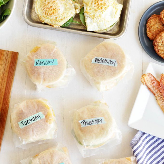
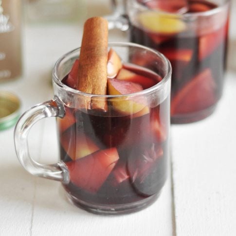
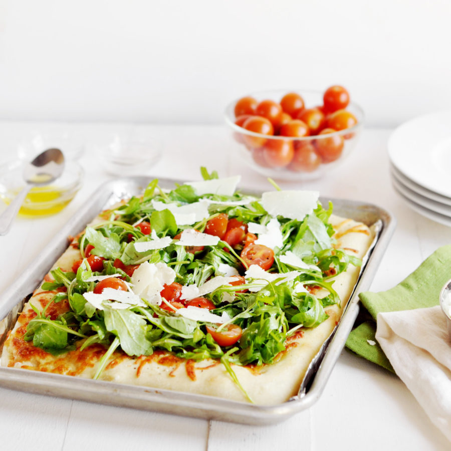
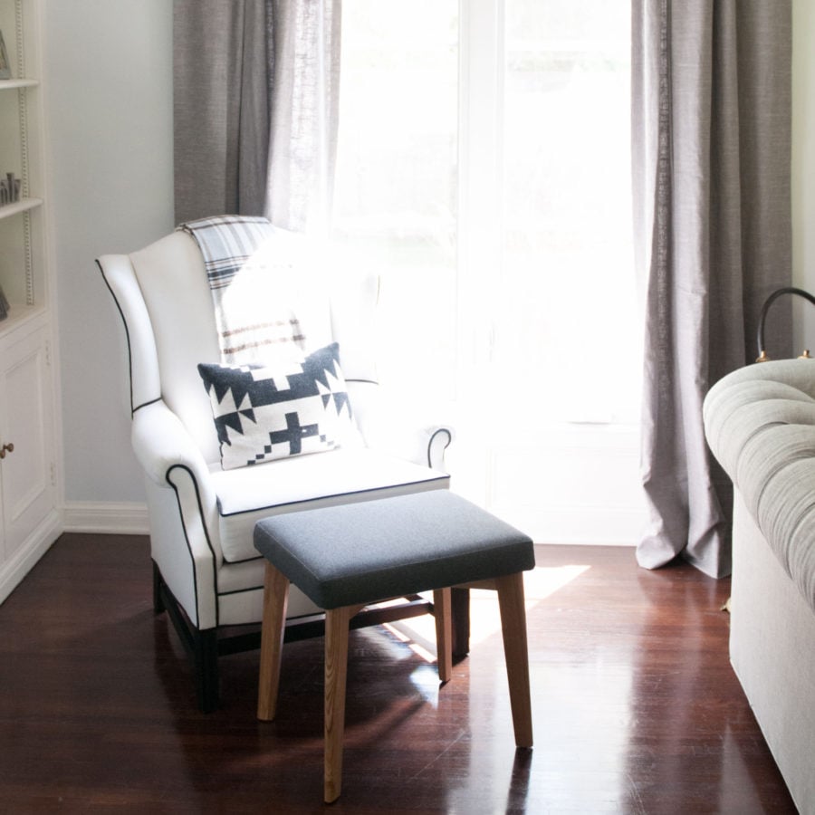
First of all, and MOST exciting for me… the website is bigger! The original Chic Site had a thinner center column and now, as you’ll see from the home page it’s all wider to expand the full measure of your screen. After all, when you’re spying on yummy recipes and home decor you want the biggest photos you can get. Also, we have a new navigation bar at the top of the home screen and it’s much more streamlined. I’ve pointed out what each section does in the picture above and if you click into each area (at the navigation above this post) you’ll see some really gorgeous new photos to go along with them.

Also, rather than a scrolling menu our home screen has a cool mosaic at the bottom of the page. It includes some of our favorite posts and will be updated monthly. It’s just so much prettier, don’t you think?

Also, if you scroll over “explore” you’ll get a drop down menu of our sections now. Please note THREE exciting new features. Instead of calling the section “home” we now call it “nest” which is what Dave and I call our house. We did this honestly because so many readers complained about hitting the “home” button thinking it would take them back to the main page but it actually took them to, our Home and Garden posts. Also, check out that last one… we now have a Books section!! Given the fact that I’m a crazy book nerd and given the fact that I actually write books too it seemed silly not to have it there. This new section will be a collection of book themed posts as well as all the details about my book tours and events. This includes both my fiction work and my first cookbook that comes out next year! And lastly, we have “Daily” section right there at the top. In case you want to see all of our post together in one place rather than divided by section, this tab is for you!

Also, in each section now there is a side bar of categories. For the longest time readers didn’t realize that you could search for items by their category and we’ve tried to make that more user friendly for you here.
It’s all bright and new and there will likely be a few glitches as we launch this week but I hope you love it as much as we do. Can’t wait to hear what y’all think!! Now click HERE and head back to the home screen.


